Pioneers of Optical Illusion
In the 1960s, during an age of rapid technological development and global societal changes, the art scene saw the establishment of a new abstract art movement. Placing emphasis on the viewer’s perception of optical elements within painting, sculpture and installation, the movement describes the artistic exploration of perceptual visual effects. Artists such as Josef Albers, Bridget Riley, Victor Vasarely and Frank Stella created some of the movement’s key artworks, although some of them dismissed the association with the term, partly due to its commercialisation and appropriation in popular culture. Together with the kinetic art movement, Op-art defined a new era with innovative techniques and groundbreaking new visual language.
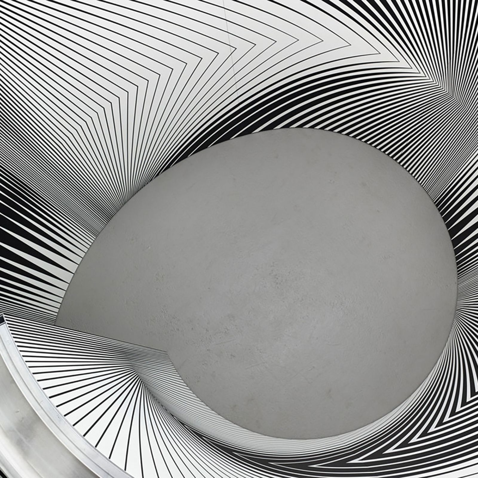
Bridget Riley, Continuum, 2005.
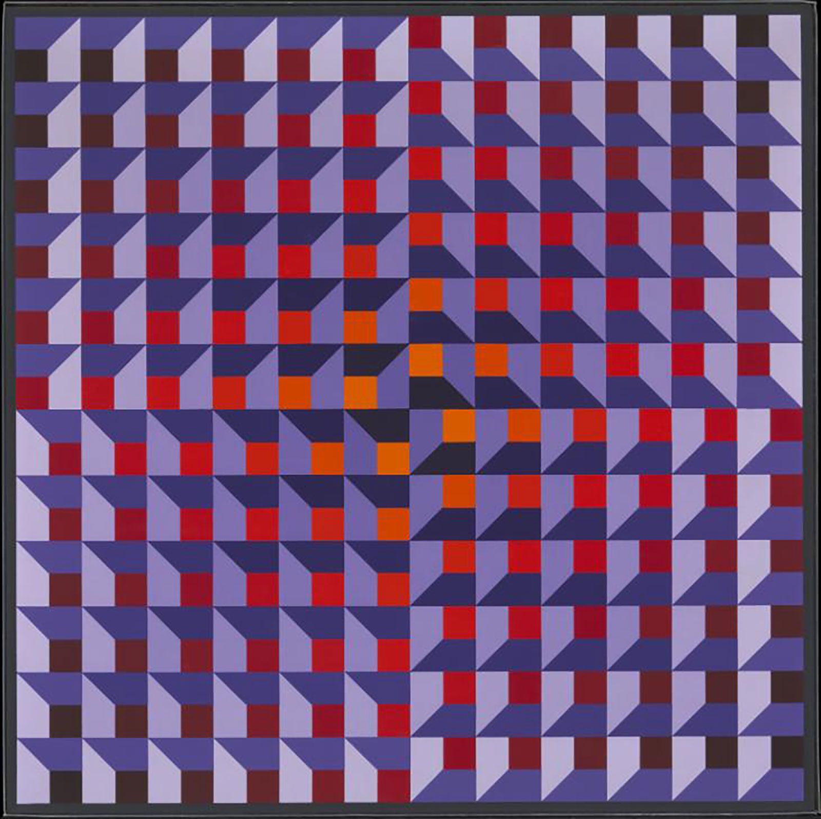
Jean-Pierre Yvaral, Ambiguous Structure No.92, 1969), Tate© ADAGP, Paris and DACS, London 2021.
Short for “Optical-Art”, Op-art uses mainly geometric forms, distorting and disorienting the viewer’s perception. Drawing on colour theory and the psychology of optical illusion, Op-art works, either three-dimensional or two-dimensional, create new perspective dimensions on the surface of the work. Visual elements such as curved lines, vertical lines, spiral shapes, horizontal waves, stripes, squares, circles and triangles are reoccurring motifs that render compositions that completely transform the artworks into compelling illusions.
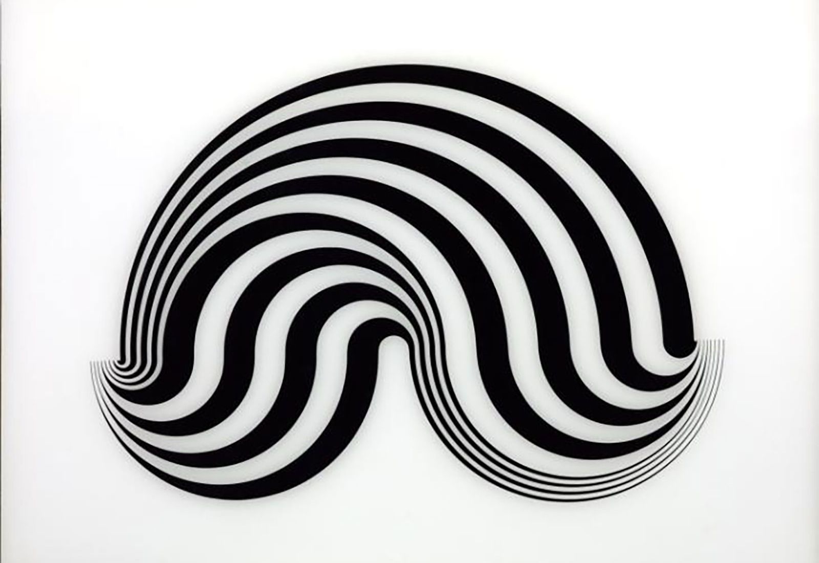
Bridget Riley, Untitled [Fragment 5/8], 1965, Tate,© Bridget Riley 2020. All rights reserved.
“I learned from Seurat this important thing about colour and light, that ‘a light’ can be built from colour. I learned a great deal about interaction, that ‘a blue’ in different parts (the same blue) will play all sorts of different roles.” (Bridget Riley)
Since early fine art practices, visual artists have utilised various painterly methods and techniques to play with perspective within the work of Neo-Impressionists such as Georges Seurat, or the theoretical writings on colour theory going back as early as Johann Wolfgang von Goethe. In 1964 however, the term “Optical-Art” was first coined in Time Magazine. The term had previously been utilised for the first time by artist Donald Judd, who wrote a review about the exhibition “Optical Paintings” by Julian Stanczak. It was then made popular when Time Magazine picked up on this new trend.
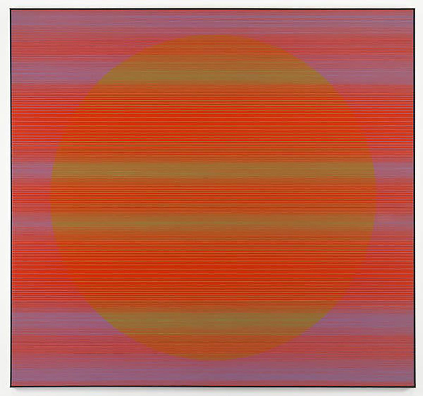
Julian Stanczak Referential Circle, 1968.
All Rights Reserved, Estate of Julian Stanczak 2017, Courtesy Mitchell-Innes & Nash, NY.
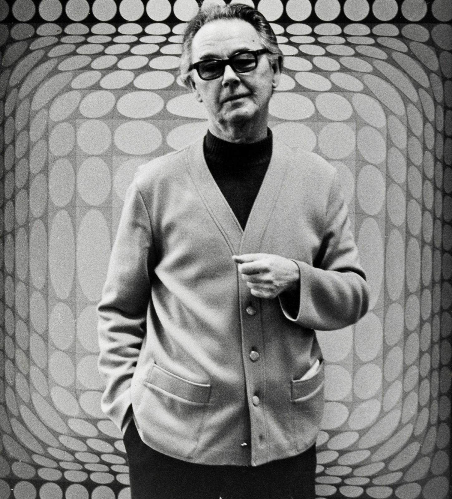
Artist Victor Vasarely.
Known as the father and leading figure of the Op- art movement, Hungarian-French artist Victor Vasarely was particularly renowned for his colourful artworks, created from a multitude of grid-like structures. Studying painting at the Podolini- Volkmann Academy in Budapest, Vasarely studied the teaching of Bauhaus that would greatly influence the patriarch of Op-Art. In his New York Times obituary, the paper described this influence as one that would create a new type of visual stimulation, linking the ethos of Bauhaus with modern design: “He thought that art would have to combine with architecture to survive, and in later years made many studies and proposals for urban design. He also devised a computer program for the designing of his art — as well as a do-it-yourself kit for making Op Art paintings — and left much of the actual fabrication of his work to assistants.”
Characteristic of his oeuvre is the use of brilliant colours, an essential element of the Op-art movement. Colour theory has greatly influenced the artistic practice of artists, such as Josef Albers, who was also influenced by Bauhaus teachings and, like many Op-artists, employed the use of simplistic geometric forms.
“Every form is a base for color, every color is the attribute of a form.” (Victor Vasarely)
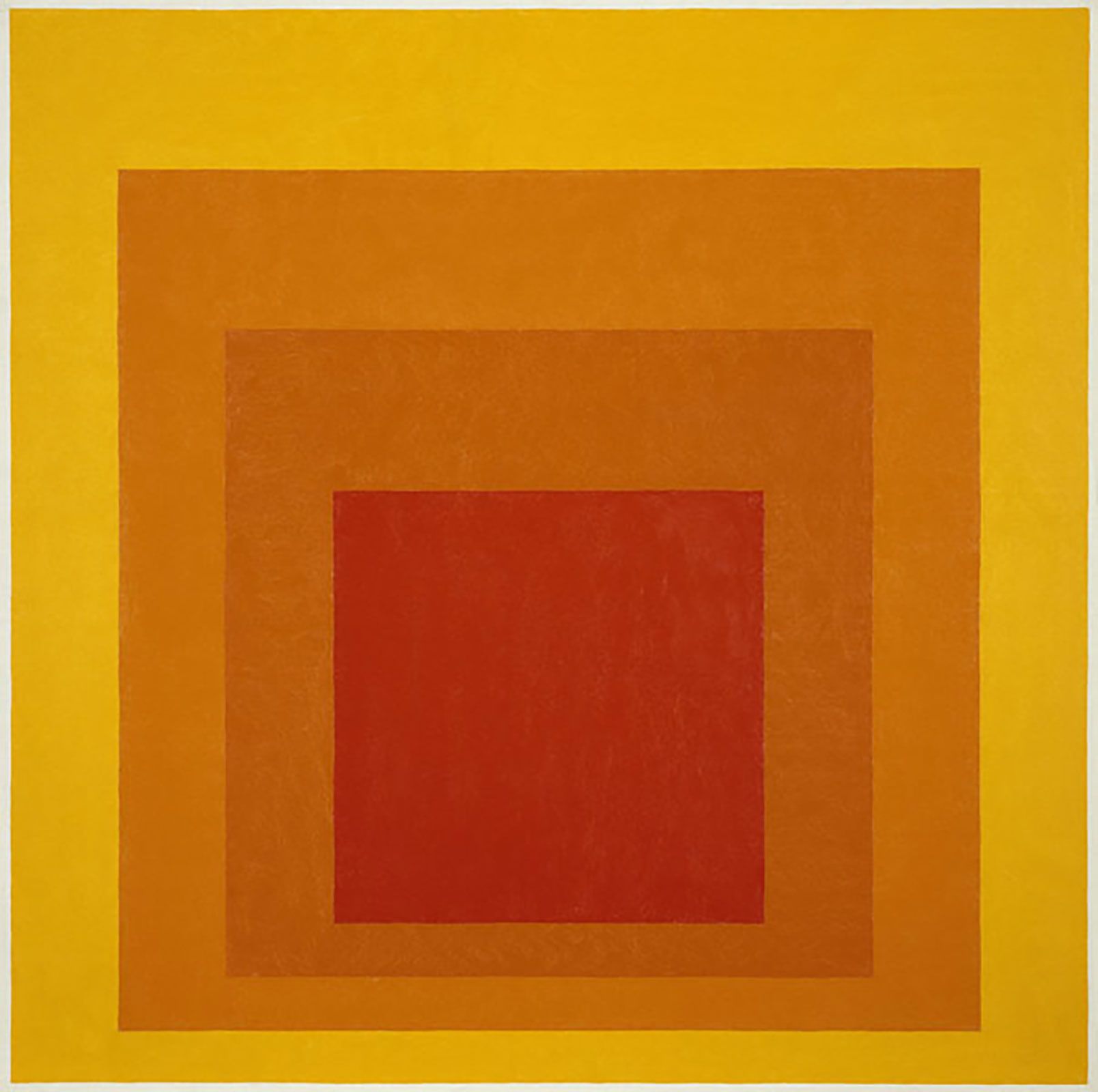
Josef Albers, Homage to the Square.
“Anyone who predicts the effect of colors proves that he has no experience with color.” (Josef Albers)
Artist Bridget Riley in her studio at her home in Notting Hill, London in 1992.
In his 1963 book titled “Interaction of Colour”, Albers outlined some of the theoretical concepts behind the psychology of Op-Art. This writing was based primarily on the artist’s foundational belief that finds colours to have their own deceptive and internal logic. While Op-art remains typically black and white, many significant artists made the use of vibrant colour as the focus and means of their illusionary optical elements. Within Op-art, contrasting colours can suggest depth and space.
Another seminal figure within the art movement was British artist Bridget Riley. As part of her practice, the perception and ways we see art have continuously been Riley’s primary subject matter. In the 1960s, she became first associated with the movement after producing a series of dazzling black and white paintings that were featured in the important exhibition “The Responsive Eye” at the Museum of Modern Art in 1965. Struggling to establish her own style as a painter, Riley often studied the work of other artists such as Georges Seurat, who she noted taught her about the importance of contrast and the interplay of tone and colour. Riley herself only introduced colour to her optical painterly practice in 1967 and has since explored its potential at length: “At the core of colour is a paradox. It is simultaneously one thing and several things – you can never see colour by itself, it is always affected by other colours. A long line of colour, essentially an “edge” without a large volume to carry, is the ideal element to work with this elusive relationship between colour and light”.